How to create your own data visualization map using live Hospital Compare data from CMS/Medicare and Tableau Public
In this post I'm going to show a step-by-step way to create your own data visualization map using *live* Hospital Compare data . By "live" data I mean that the data visualization we create will update automatically when CMS updates its data set; we will not have to download the new data, rather we will build the connection between Tableau and the public data available on CMS' web site.
Here is an example of the end product we will build:
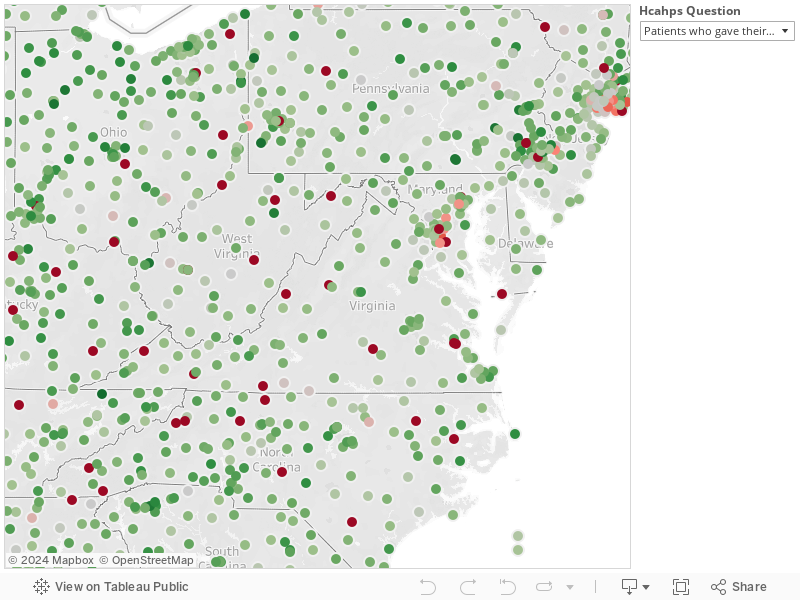 Just to summarize what the above map shows: Each hospital is represented as a circle on a map, color coded by its score on one of the questions from the HCAHPS survey. The user can click on the filters on the right and move the map to look at other state's hospitals, and switch which HCAHPS question he is interested in. What's *REALLY* cool though, is that this data is not static. When CMS updates the hospital scores, our map will update automatically.
To build the above:
First, download the newest version of Tableau Public. Tableau is the software that you will use to build the above interactive map. Next, find the dataset that you are interested in analyzing. There are many open datasets available for public consumption. I'm personally interested in healthcare data. For this example, go to Hospital Compare (https://data.medicare.gov/).

Click on "Hospital Compare."

Scroll down and choose the dataset you would like to explore. For this example, I chose "HCAHPS - Hospital." (click on it). You could instead choose "HCAHPS - State," which has state-level patient satisfaction scores instead of hospital-level data. Obviously, the state level data set is a lot smaller and easier to handle, but also much less interesting.

This is what it should look like. What you will see is a scrollable table of all of the HCAHPS data. In the top right section you will see many options for playing with and exporting the data.


Where it says "Copy this link", copy the link. Simple enough.
Now open Tableau. This is what it should look like when you first open it:

Click on "Open Data." (It's not a bad idea to watch some of the getting started videos)

Next, you are given options as to what sort of data you want to connect to. Click on "OData."


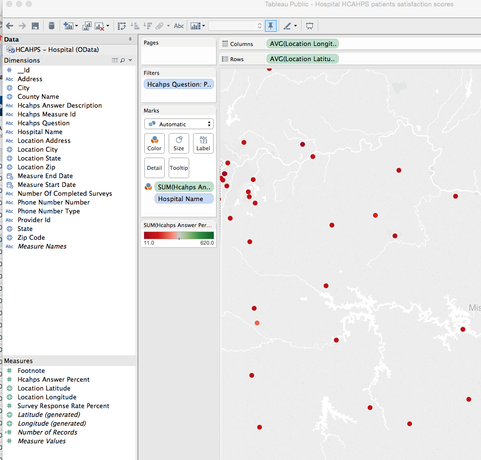
 Drag "location latitude" (from under "Measures") to the empty white box next to "Rows" (at the top). And then drag "location longitude" to "Columns." It should look like this afterwards:

Next, we want to focus on just one HCAHPS question at a time, so we will add a filter. Drag "Hcahps Question" from the "Dimensions" section into the "Filters" box to the left of the map. Scroll down the options of what to filter, and choose which question you want to visualize. I chose the next to last one, "Patients who reported YES, they would definitely recommend the hospital," because I think that is the best overall measure of patient satisfaction (Likelihood to Recommend).

Next comes the fun part --- we need to actually add the hospitals to the map. So drag "Hospital Name" from the Dimensions section into the white box labelled "Marks". Drag it UNDER the tooltip, not into it (for now). You should see each hospital as a little dot on the map now. Tableau knows where to put each one because each hospital is mapped to a specific longitude and latitude. Amazing.

Now, we want to color-code each hospital by its score. So drag "Hcahps Answer Percent" from the Measures section into the "Color" box under "Marks."
Now each hospital should be color coded by its Hcahps score for the question you clicked in the filter. But notice that every hospital looks red and the scale for the score goes up to 620. That's because it is set to "SUM". We need to change it to average. Click on the green oval labelled "SUM(Hcanps An.." in the Marks section, then "Measure" then "Average". Zoom the map out. It should look something like this:

Now click on "Hcahps Question P.." in the Filters section and check off "Show Quick Filter". This will create a clickable filter on the right, so that you can choose different HCAHPS questions.
Now, we want to make sure that when we click on a dot we see the name of the hospital and its score. Click on the rounded box labelled "Tooltip." It should be empty. Click on "Insert" to insert whatever fields you want to add and you can manually type in labels for those fields. Here is what mine looks like:

Click OK. Now when you click on a hospital dot, you should see the hospital name and score.
Really awesome! Tableau can do so much more than this, but this is a great way to get your feet wet.
Now you can click on File > Save to Web to save or share this creation of yours.
You should know a couple things: with Tableau Public, which is free, your data visualizations are public. If you want to analyze non-public or secure data then you will need to purchase a different version of Tableau.
Here is an example of the end product we will build:
To build the above:
First, download the newest version of Tableau Public. Tableau is the software that you will use to build the above interactive map. Next, find the dataset that you are interested in analyzing. There are many open datasets available for public consumption. I'm personally interested in healthcare data. For this example, go to Hospital Compare (https://data.medicare.gov/).
Click on "Hospital Compare."
Scroll down and choose the dataset you would like to explore. For this example, I chose "HCAHPS - Hospital." (click on it). You could instead choose "HCAHPS - State," which has state-level patient satisfaction scores instead of hospital-level data. Obviously, the state level data set is a lot smaller and easier to handle, but also much less interesting.
This is what it should look like. What you will see is a scrollable table of all of the HCAHPS data. In the top right section you will see many options for playing with and exporting the data.
Click on "Export." As you can see, you can download a static version of the data in Excel or CSV format, but that is not what we are going to do. Instead, click on "OData." OData is an open data access protocol that allows us to connect to live data (there's a lot more to it, but you don't need to know more for this project).
Now open Tableau. This is what it should look like when you first open it:
Click on "Open Data." (It's not a bad idea to watch some of the getting started videos)
Next, you are given options as to what sort of data you want to connect to. Click on "OData."
Paste the link from the CMS website (the one we copied) into the first field, as I have done above. You should not need to enter authentication information for this dataset. Click on "Connect." If this step works, it should look like this:
Notice that Tableau figured out the name of the dataset ("HCAHPS - Hospital (OData)"), so we are connected now to live data! Click on "OK." Tableau will now essentially go through all of the data and process it. For a big dataset such as this one, this could take 5-15 minutes. Be patient, this is a one-time process. Tableau will be loading the data onto its servers.
This is not the time and place for me to teach you how to use Tableau -- there are plenty of great demos on You Tube -- you should watch some of these while the data is loading.
Here is the window you will see while the data is loading:
Once the data is loaded, you will see the main Tableau page:
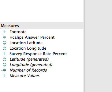
Your data is essentially auto-divided into "Dimensions" and "Measures." Please watch Tableau introductory videos to learn the difference. You have many options to visualize the data; we are going to build a quick map. We want to see each hospital listed individually on a map and color coded by its HCAHPS score. To do this, we need to know the longitude and latitude of each hospital; thankfully the dataset we connected to already has this data under "Measures." Note that there are two sets of longitude and latitude: one set says "location latitude" (this is directly from CMS' data set) and the other set says "generated" (this is a calculated latitude or longitude based on the zip code [that's my understanding, I may be wrong]). Because there may be more than one hospital in a single zip code, you want to avoid the "generated" data and instead using the ones labelled as "location latitude" (and longitude). The other reason to do this is because by using the actual long/lat data, the hospital will be placed accurately on the map, whereas otherwise it would be placed at the zip code marker.
Drag "location latitude" (from under "Measures") to the empty white box next to "Rows" (at the top). And then drag "location longitude" to "Columns." It should look like this afterwards:Next comes the fun part --- we need to actually add the hospitals to the map. So drag "Hospital Name" from the Dimensions section into the white box labelled "Marks". Drag it UNDER the tooltip, not into it (for now). You should see each hospital as a little dot on the map now. Tableau knows where to put each one because each hospital is mapped to a specific longitude and latitude. Amazing.
Now, we want to color-code each hospital by its score. So drag "Hcahps Answer Percent" from the Measures section into the "Color" box under "Marks."
Now each hospital should be color coded by its Hcahps score for the question you clicked in the filter. But notice that every hospital looks red and the scale for the score goes up to 620. That's because it is set to "SUM". We need to change it to average. Click on the green oval labelled "SUM(Hcanps An.." in the Marks section, then "Measure" then "Average". Zoom the map out. It should look something like this:
Now, we want to make sure that when we click on a dot we see the name of the hospital and its score. Click on the rounded box labelled "Tooltip." It should be empty. Click on "Insert" to insert whatever fields you want to add and you can manually type in labels for those fields. Here is what mine looks like:
Click OK. Now when you click on a hospital dot, you should see the hospital name and score.
Really awesome! Tableau can do so much more than this, but this is a great way to get your feet wet.
Now you can click on File > Save to Web to save or share this creation of yours.
You should know a couple things: with Tableau Public, which is free, your data visualizations are public. If you want to analyze non-public or secure data then you will need to purchase a different version of Tableau.
Comments