The positive correlation between hospital costs and quality was debunked long ago, nonetheless it's still interesting to look at the data in new ways. Here I've combined two different data sets: first I took the hospital charge data that was published earlier this year by CMS and compared it against patient satisfaction or "perception" data from HCAHPS:
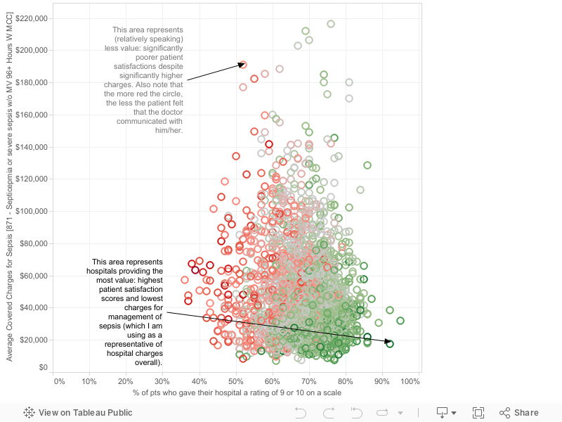
Let me explain the graph. Each circle represents an individual hospital. The x-axis represents patient satisfaction as measured by the HCAHPS question representing the percentage of patients giving their inpatient visit a score of a "9" or a "10." The y-axis represents the average charge (the amount the hospital billed Medicare, not necessarily the amount the hospital actually got paid) by the hospital for management of sepsis, which I am using as a surrogate measure for hospital charges overall. I chose sepsis because it is a common medical syndrome for which we have lots of data and recommendations, and it is a high-risk syndrome whose proper treatment requires all the different moving parts of a hospital to be well functioning. Therefore, I think it is a good indication of hospital functioning and efficiency. Or, in other words, hospitals that follow sepsis protocols really well will probably have shorter hospital stays and therefore smaller charges (this is my hypothesis). The color of the circle represents to what degree the patients perceived that doctors communicated with them (HCAHPS data, see my other recent posts); green means the patients perceived more and better communication with the doctor and red the opposite.
The boundary cases are really interesting: Oklahoma Heart Hospital and Hamlin Memorial Hospital may represent the best "values" when measured by my mechanism above. They each have very high satisfaction scores, along with some of the smallest charges, and very high rates of communication by doctors. On the other hand, Crozer Chester Medical Center in Pennsylvania appears to have much lower satisfaction scores and significantly higher charges, as well as poor physician communication.
Comments